Background
SheCredit is a non-profit financial organization that supports businesswomen in achieving their entrepreneurial goals. In the winter of 2024, I created an updated logo for them and launched a new branding campaign.
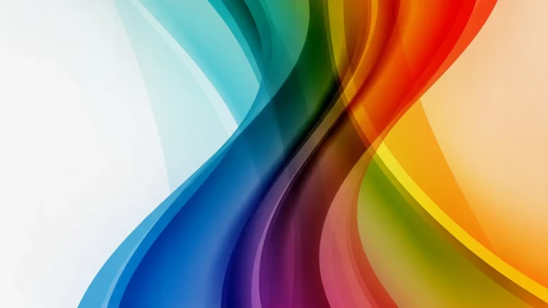
Visual Flow
My goal for this project was to create a landscape version of the SheCredit logo. The original logo was circular, but the organization needed a new version for various applications, such as landscape videos.
My approach was to keep the design simple. I aimed to highlight the logo icon in a subtle yet impactful way, while incorporating the company’s new tagline, “We are the Queenmakers.”
To emphasize the word “Queenmakers” and create visual flow, I used orange for this word, setting it apart from the rest of the text. This design choice reinforces the orange accents at both edges and guides the viewer’s eye from the top left to the bottom right.
Reflections
Although I don’t often work with logos anymore, this was an enjoyable small project. I believe my concept and the speed with which I executed the design exemplify my skills and the growth I’ve experienced over the years. I’m happy with the work I’ve delivered and proud to be involved in this project.