


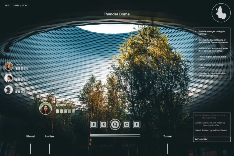
“What Happened Here” is a visionary exploration into the realms of a video game concept, and fantasy world exploration through flight.
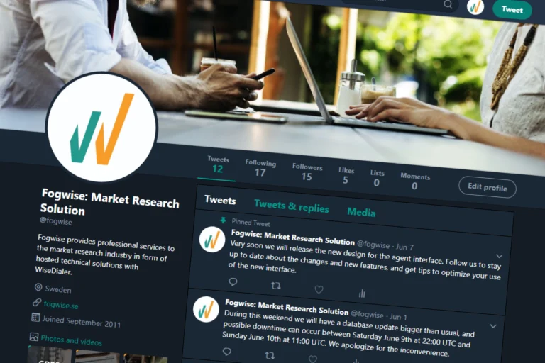
Developed a social media strategy for Fogwise, a Swedish market research company specializing in VOIP-based automated dialing solutions. The strategy aimed to enhance customer support and promote new features.

Designed clear and unintrusive direct mailers for Opinion 11:12, a survey service, to effectively communicate their offerings and encourage participation.