
Norrköping Roots, Modern Design
NKPG.Design, a Norrköping-based design agency, takes inspiration from its Swedish hometown. Their brand identity reflects this by seamlessly blending:
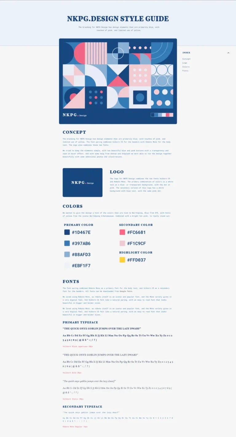
- Local Connection: A nod to Norrköping’s heritage through its color palette.
- Modern Design Approach: A focus on clear communication and user experience.
A Strategic Color Palette
Color plays a vital role in shaping NKPG.Design’s brand identity:
- Dominant Dark Blue: Derived from Norrköping’s IFK, signifying strength and stability.
- Accenting Pinks: Warm and light pinks add vibrancy and personality.
- Sparingly Used Yellow: Emphasizes critical information and calls to action.
Color Harmony for Impact
These colors work together strategically:
- The dark blue foundation creates a strong base for the brand identity.
- Vibrant pinks are used in smaller doses to attract attention and highlight key elements.
- Yellow is reserved for critical situations to emphasize its importance.
A Consistent Voice: Balancing Typefaces
NKPG.Design utilizes two fonts for optimal impact:
- Primary Font (Capitalized): Highly legible for headlines and branding elements.
- Secondary Font (Sentence Case): Tech-inspired font for body text, ensuring readability.
Beyond Aesthetics: Building a Brand Narrative
The NKPG.Design brand identity goes beyond visuals. It’s a strategic combination of design elements that tells a story:
- Memorable Brand Presence: Leaves a lasting impression on potential clients.
- Clear Communication: Emphasized through user-friendly fonts and strategic color use.
- Cohesive Brand Journey: Creates a consistent visual language across all platforms.
