Background
This project aimed to create a modern and cohesive brand image that transcended interfaces and marketing materials.
Envisioning a Modern Fogwise
From 2016 to 2018, I played a key role in modernizing Fogwise’s brand identity. Fogwise provides market research solutions through a VOIP-based automated dialing service. My responsibilities encompassed:
- Revamping the Brand Image: Developing a modern brand identity that reflected Fogwise’s future aspirations while respecting its heritage.
- Ensuring Brand Consistency: Guaranteeing the brand identity permeated all customer touchpoints, including system interfaces, marketing materials, and internal documents.
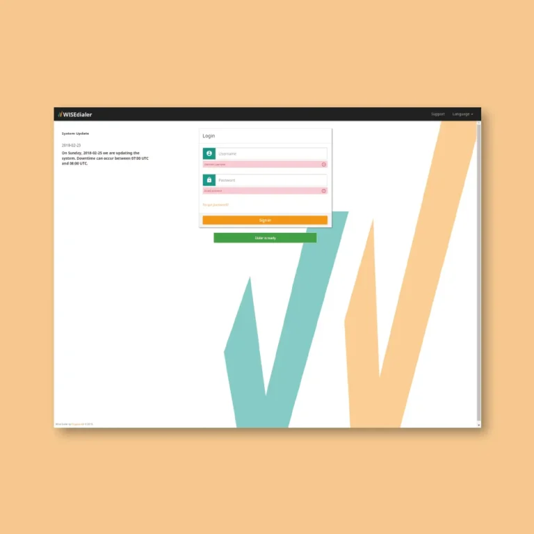
Thematic User Interfaces & Cohesive Visual Language
To enhance user experience and brand recognition, dark and light themes were implemented for the admin and agent interfaces respectively:
- Dark Admin Theme: A sophisticated and professional look suited for administrative tasks.
- Light Agent Theme: A clean and approachable aesthetic optimized for agent comfort during extended use.
This approach balanced distinct user experiences for each interface while maintaining a unified visual language across the entire system.
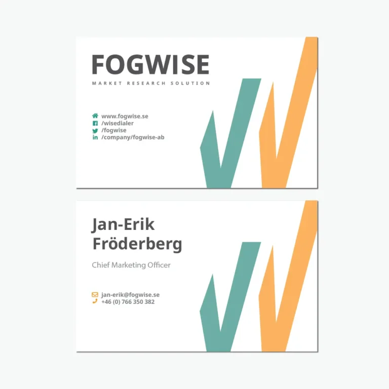
A Meaningful Logo
The Fogwise logo design was meticulously crafted, drawing inspiration from the company’s core function:
- Data Visualization Symbolism: The central “W” in the logo resembles a chart, signifying data collection and analysis.
- Connecting Past & Future: The varying lengths of the “W” arches subtly imply improvement in results, reflecting Fogwise’s commitment to progress.
- Brand Color Integration: The separation of the arches allows for the incorporation of the two brand colors.
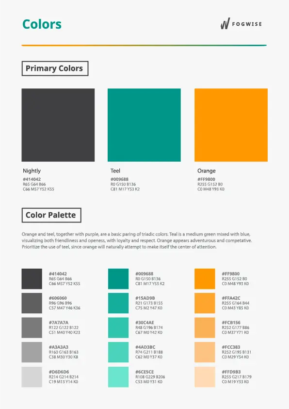
Comprehensive Style Guide for Brand Consistency
A comprehensive style guide was developed to ensure brand consistency across all applications. This guide detailed:
- Logo Variations: Defined the proper usage of the logo in different contexts.
- Color Palette: Specified the two brand colors, orange (representing individuality) and teal (adding a modern touch).
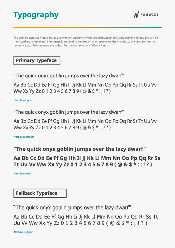
- Typography: Established the “Noto Sans” font for optimal readability and multilingual support across the system and marketing materials.
Bringing the Brand to Life: Marketing Materials & Beyond
Following the brand identity development, I designed various materials to solidify Fogwise’s brand image:
- Email Signatures: Professional signatures for consistent brand communication.
- Desktop & Mobile Backgrounds: Visual reinforcements of the brand across devices.
- Business Cards: High-quality business cards for networking and brand promotion.
- Marketing Collateral: Print and digital marketing materials that aligned with the brand identity.
- Website & Interface Integration: Ensured seamless brand integration within the Fogwise website and user interfaces.
Reflections
Despite some initial reservations regarding execution, the innovative concepts embedded in the logo were enthusiastically received by Fogwise’s leadership. The project provided an invaluable learning experience, fostered by the freedom and trust I was given. This experience solidified the importance of brand consistency across all aspects of a company’s image.